The $300M button and other lessons
Design defaults shape behavior
The story of the $300M button made a big splash over a decade ago when it was first covered in a book called Web Form Design: Filling in the Blanks. I recently stumbled upon it and was immediately captivated.
It’s a great example of how designs can impact a business, in this case to the tune of $300M. It’s also a reminder of how defaults matter, shape user behavior, and even influence power dynamics.
A simple button change
There were only two buttons: Login and Register. What could go wrong? In isolation, the buttons were innocent enough. But the first red flag was they showed up right after a user clicked “Checkout”.
The company, rumored to be Best Buy, hired a usability researcher. In the tests, users happily added stuff to their cart, made their way into checkout… and then froze.
The first-time users were annoyed they had to register to complete their purchase: “I’m not here to be in a relationship. I just want to buy something.” The repeat users were also annoyed. Most of them couldn’t remember their login and password.
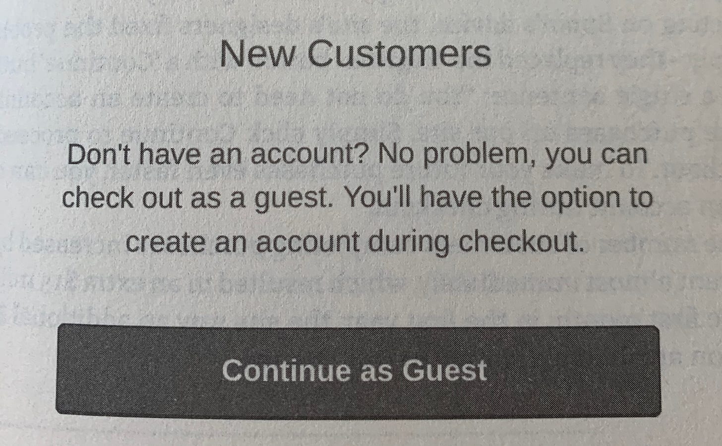
The improvement they tested was simple. They replaced the “Register” button with “Continue as Guest”, and included some reassuring copy on what would happen next:
The results were eye-popping: the number of ordering users shot up by 45%, resulting in an extra $300M that first year. Even better, 90% of the ordering users ended up creating an account as part of the checkout completion process.
Hidden lessons
This isn’t an ode to the invention of guest checkout. While that was the solution in this specific instance, the more universal lessons behind this story are:
Understand customer expectations — asking someone to “register” after they just spent energy creating an order is poor timing and poor framing. The best time to make a big ask is when you tie it to something very rewarding (e.g., access to a special feature) or when it’s aligned with what they want to do (e.g., fill out address to receive shipment).
Track click data — this company was not tracking any clicks. When they finally started logging events, they found that most users bailed after seeing “Register” and “Login”. The usability study saved them, but measuring conversion would have raised the alarms much earlier.
Being customer-centric is good business — the unexpected plot twist was that nearly everyone was happy to register at the end when they saw value in doing so (e.g., receiving shipping updates). The best path to capturing sustainable business value is to create a lot more customer value.
Defaults matter
There’s a reason why Snapchat opens to the camera, TikTok opens to the For You feed, Instagram places Stories at the very top of the feed. They are making a statement about what’s important to the product, but more importantly, they know it shifts behavior. Most users stick to defaults, and defaults get better the more they are used.
Search has been the default for the internet. It was the first solution to make sense of this new world of abundance. Amazon uses search as the portal to its mighty everything store. But could there be a better solution?
I recently ordered boba ice cream on Instacart after watching a rave review on TikTok. I’ve even been tempted to book an idyllic hotel in Switzerland after seeing it on TikTok. All of this sounds comical, but it begs the question of whether there’s a new, powerful default in the room.
Search gives you whatever your heart desires and asks for. Browse can give you whatever your heart desires… before you know to ask for it. Search is still the fastest path to manifesting what you want at any given moment, but we’re now in the early days of what life is like when products know you better than you know yourself.
In many ways, browsing is more akin to the offline world where you have serendipitous conversations, discoveries… and more fun. Trader Joe’s turns a normal grocery run into a delightful treasure hunt for cauliflower gnocchi. Pinduoduo, an $87B company based in China, also took this to heart, creating a social ecommerce product based on browsing a feed of products and sharing with others to lock in steeper savings.
Amazon, on the other hand, caters to people who prefer to avoid shopping altogether. You type into the search box, use one-click checkout, schedule recurring order, and you’re done. No romance required. Those who actually enjoy shopping are left with a million different websites of varying quality.
TikTok is sitting on a treasure trove of e-commerce potential, and they seem to have the product chops to make shopping fun again.
The balance of power
You search for the known, you stumble upon the new. Search helps the rich get richer. After all, most users do not venture past the first few results. Browse, however, opens the gates to meritocracy.
Pre-internet, brands had all the power because they were the gatekeepers. Then the internet search bar became the de facto gatekeeper. You can still search for brands, but they’re entirely dependent on you remembering their name. As we shift towards a browse-based world, brand power vanishes entirely and shifts to the player that captures the demand.
That’s not to say great brands can’t break through. If they receive high engagement, they will still prevail, but the competition is far more fierce. All this to say that if you’re really serious about maintaining your power, you should build a direct relationship with your users.
A great product is like a well-organized orchestra where all the instruments complement each other, from product design to the business and data model. Silly designs and no data analysis can cost you millions and the trust of your users. Selecting your default can shift user behavior and even influence the balance of power. Choose wisely. :)
Subscribe below for weekly insights. You will also receive a FREE welcome gift: 7 secrets to accelerate your (product) career! 🎁
Thanks for reading!


